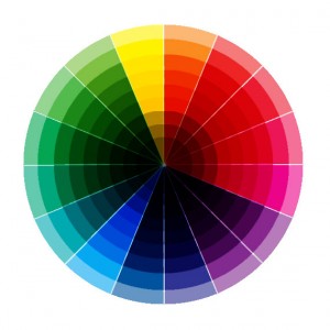
Longtime friend and supporter of A Life’s Work, blog contributor, and all-around awesome guy Haroon Butt recently sent me an email. “Weird question. How did you decide the colors of your website? They really fit.”
 Not a weird question at all. In fact, a very good question! I wanted colors that suggested concrete buildings, because in my mind that suggested longevity; buildings often outlive us. So the grays were all about that, the grays around the images, too. Blocks of concrete. Building blocks. I could have chosen greens to represent trees and nature, but I thought that was kind of trite. I also really like those shades of gray and have had apartments painted those colors. So they were pleasing to me. And that’s a reason not to be dismissed. (In college I had an art teacher who made abstract sculptures. One was titled “Cutty Sark.” I asked him why he called it that and he said, “I like Cutty Sark.” That was very liberating!)
The brown color of the links was once darker, but it wasn’t that much different from the non-linked font, so I went a little lighter. But I couldn’t go too light. So that was a practical decision. The brown of the “contribute to the film” button is similar to the links, but a darker because I wanted it to pop out a bit. Text in that button is the same as the background. The idea here was the brown was chiseled away, like the date in a cornerstone. It also just made sense. All of the colors could be considered “Earth tones” and I like those words together. Earth. Tones.
So it was a combination of running with an idea, liking the colors, and practicality. I’m glad you like the color scheme!
Obviously, color choice is a huge consideration in film, especially in narrative films where you have more control of your surroundings. I remember having extensive conversations about colors with the cinematographers and production designers I worked with on both of my films. “This shade of blue or that shade of blue.” And though it might seem not to matter, it does matter. It’s a choice and shouldn’t just be random. There should be a reason behind it, even if the reason is, “I always find that shade soothing.” Color helps deliver the message in a big way.
Thanks for asking. It was fun thinking about it again. I selected the colors so long ago I had kind of forgotten why I chose them.
Do you have a question for the filmmaker? Well do you, punk? Go ahead and leave it as a comment or email it to me: d a v i d {@} b l o o d o r a n g e f i l m s {d o t} c o m

C Kerman
I have met the author, and let me tell you, he is all about these colors in person: complexion, hair, eyes, clothing. That’s all.
David Licata
It’s true. My appearance is all grays and browns. Oh, but the colors I SEE!!!