I was going through my closet the other day and came across a flat file that contained this:
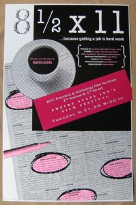
This poster, designed by Heidi Fener, is for my first film, 8 1/2 x 11. (Heidi also designed the poster, postcards and DVD cover for Tango Octogenario.)
8 1/2 x 11 was an exercise in economy, from script to publicity materials.
I love what Heidi did here. She knew I had limited resources, so she designed something I could duplicate in any b&w copier that would make 11 x 14 inch copies (such as the copier at the job I had then) and left space for me to put date and venue information. The graphic elements worked well together–the highlighter is black and white, but I colored it in pink along with the stars names* and the job listings (they are of the jobs the interviewee in the film is up for). The date and venue info was printed as needed on a label sheet using a standard ink jet printer (such as the printer at the job I had then). For the film’s premiere in Taos, NM, I ordered a bunch of pink highlighters with the film’s title and tag line on it and handed those out to the viewers. Pretty cohesive for a first, short film.
I love the challenge of working with limitations and turning them into assets. It’s actually the kind of thing I live for, maybe because I never have had unlimited resources. Certainly production of A Life’s Work was conducted that way,** and now, as I head into post, the real challenge of doing a lot with very little will ramp up.
* The font may be too small in this image to read her name, but if you watch the film you may recognize a certain Meredith Grey. Yeah, that Ellen Pompeo. If you want to know what she was like on the set, go here.
** Just to be clear, there is a world of difference between doing a lot with a little and cutting corners. I don’t believe in cutting corners, and I don’t believe people should work for free. I respect a person’s time and talent. I may not pay the folks I work with what they make on a union gig, but I don’t insult them, either.

